
Following the techniques provided to me in class, I was tasked with creating a horror film poster utilising facial symmetry with my own portrait as the subject. I am to also provide a PMI regarding the finished product shown below.
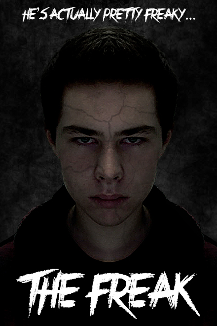
P: I am somewhat pleased with my end product of this activity. I am happy with how symmetric I managed to make my face without any major flaws and also the overall mood of the piece. I am especially satisfied with how the crack across my face turned out. The crack in the image I used as an overlay seems to almost follow the contours of my face in some areas making it seem much more authentic.
M: I’m a little disappointed in the overall appearance of the image. While I quite like the font, I feel the pure-white text does not particularly compliment the rest of the graphic. Several areas around my face could also have used some more editing in order to make my head blend more naturally into the background.
I: If I were to do this again I would, first off, take my portrait with a better quality device. I feel a higher resolution image would have allowed for more opportunities upon editing, using filters, etc. Next time I may also want to go a little further with the crack detail on my face (once again limited by the initial photo quality) and play around more with the text, perhaps implementing a subtle gradient. Lastly, focusing a bit more with the Burn Tool could have allowed for my head to fit more naturally into the background as the light reflecting off of certain edges jars the overall aesthetic.
