
DESIGN DETECTIVE #1: JOHANNES GUTENBERG
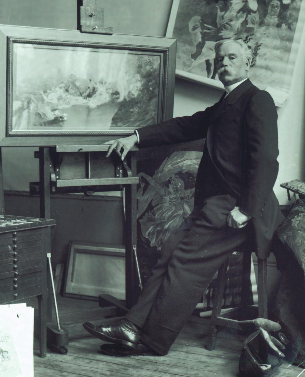
 Johannes Gutenberg, born 1398, is remembered today as a man of numerous professions. He is recognised for his achievements as an inventor, engraver, printer, publisher and blacksmith.
Arguably his most renowned achievement was the invention of the movable-type printing press, a mechanism that employed a casting system and metal alloys. This simplified the traditional wood-based printing process and ignited the Printing Revolution, facilitating and broadening the circulation of information and concepts and, consequently, furthered the understanding throughout the societies that Gutenberg’s invention reached.
An example of a poster that employs a Letterpress technique is the below advertisement poster. It promotes the launch event of a print studio owned by artist-led organisation Print to the People.

DESIGN DETECTIVE #2: ALDUS MANUTIUS

Aldus Pius Manutius, born 1449 in Bassiano within the Papal States of Italy, is famous for his numerous contributions to the world of print and type. These achievements include the invention of italic type, establishing the way in which we use the semicolon today, as well as introducing his people to cheaper, smaller, more portable forms of book, providing a less-costly method of publishing and circulating new concepts and ideas.
Manutius lived during the Italian Renaissance period, a time of significant cultural evolution in philosophy, art, music, literature and more. Earning its title, as renaissance is French for rebirth, the period is said to have been triggered as the Central Italian states, largely Tuscany and Florence, aligned and merged culturally with Venice. Here, each states’ remains of Greek culture was reunited and this provided humanist scholars, such as Manutius in his early years, with new texts and new understandings.
During his time as a printer and publisher, Manutius worked with punchcutter Francesco Griffo and writers Plato and Pietro Bembo.
Fast forward 500 years…
Aldus Corporation, founded by Paul Brainerd, is credited today for the development of the term “desktop publishing”. The company is named after aforementioned Venetian printer, Aldus Manutius.
In September 1994, Aldus Corporation, after facing stiff competition, merged with and relinquished the rights of its software and typefaces to rival company Adobe. As a result of this, the Desktop Publishing system considered industry-standard today is Adobe’s own Adobe InDesign.
DESIGN DETECTIVE #3: JULES CHERET
Jules Chéret, born May 31st, 1836 in Paris France, was an artist and designer specialising in painting and lithography. He is remembered today for his contributions as a poster creator, having learned and adapted a British approach to design and employing it to French culture.


Lithography, one of Cherét’s specialties, is a form of printing in which an image is drawn onto a smooth, flat surface (such as limestone or metal plates) with a substance that is miscible, or unable to form a solution with water, such as oil or wax. The stone would then be treated with a chemical combination that would etch the surface uncovered by the original drawing. Upon doing this, the surface would only retain ink in the spots where the original drawing existed, allowing for replications of the graphic to be printed repeatedly.
Art Nouveau is a global philosophy and style of art that recognises and adapts the natural forms and structures of organic instances such as plants and flowers and, in general, curves. Art Nouveau is identified as a total art style, as it influences all facets of art and design ranging from architecture and jewelry to graphic design and textiles.
High production colour printing was no doubt an enormous development in the world of print, design and graphic art in general. It provided a new dimension with which the artist or designer could interact and engage with an audience, and then not have to limit that effect to a select few, but instead replicate the work: create it a thousand times over and expand that engagement to an entire territory. It would have caused, what I imagine, a similar reaction to the introduction of television or the internet, or Johannes Gutenberg’s introduction of the printing press: an entirely new dimension to the broadcasting of ideas and concepts to an entire society, It would have been unbelievable.


The posters above are what I consider as today’s equivalent of Chéret’s works: posters that, while advertising film, are still very heavily pieces of visual art. Created by Olly Moss for Lucasfilm and design company Mondo, the graphics are advertisements for the original Star Wars films.
The three posters each employ the logo and type of their respective film. As for graphics, each poster employs a minimalist, double-exposure effect. It begins with a plain, non-distracting cream background, and overlays it with the silhouette of a primary character. Within the silhouette is a scene inspired from the movie. Moss has also used specific elements within the environment to further the likeness of the implied character, whether it be the two suns to imply C-3PO’s eyes, Cloud City to imply Boba Fett’s visor, or the Endor trees to subtly outline Darth Vader’s mask.
Each poster primarily consists of varying shades of a single, dominating colour, respective of the portrayed environment (ie. Warm pink for for the desert planet Tattooine, Orange for Bespin and green for the overgrown planet of Endor). Regarding the substrate of the pieces, the three are all screen printings. The telltale signs of which can be seen in the texture surrounding the borders of the silhouette.
DESIGN DETECTIVE #4: SHEPARD FAIREY
 Shepard Fairey, born on the 15th of February, 1970 and raised in the city of Charleston, South Carolina, is a contemporary artist and activist specialising in graphic design, illustration, stencilling and street art.
Fairey’s interest in the visual arts, particularly drawing and painting, began at a young age and developed through his studies at the Rhode Island School of Design. During his time there, specifically 1989, Fairey began the ‘Andre the Giant Has a Posse’ sticker campaign, a movement heavily facilitated by Rhode Island’s skater community, of which Fairey was a member of.
In the short film ‘Shepard Fairey: Obey This Film,’ Fairey claims his purpose behind his activist works is to inspire people to reconsider their dispositions on topics like politics and war and national identity, and that applying it to the streetscape improves the likelihood of him achieving this purpose. “Public art, I do think, impacts people very profoundly. And sometimes it’s a hostile response, but anything that stirs the debate, I think, has value.”

Shepard Fairey employs a variety of techniques into his work as an artist. The first of which is stencilling, an example of this technique featured above. Stencilling is the removal of a graphic from a sheet of material or fabric and spraying aerosol paint through the empty space. As the paint passes through and onto the surface behind, an imprint of the removed graphic is left.


DESIGN DETECTIVE #5: ROY LICHTENSTEIN

Roy Lichtenstein, born 27th October, 1923 in Manhattan, New York, is best remembered for his role as a leading figure in foundation of the American pop art movement. Pursuing his childhood interests through enrolment of Summer classes at the Art Students League of New York, Lichtenstein studied under painter Reginald Marsh before moving to Ohio State University, earning a degree in Fine Arts in 1940 and a Master of Fine Arts nine years later after time in World War II.
Lichtenstein’s pop art style takes heavy inspiration from the simple, cell-shaded aesthetic of the comic books of his time. The style also shares visual similarities with the products of today’s screen printing techniques, featuring repetitive use of overlaying colour and line to create a composition.


DESIGN DETECTIVE #6: SAUL BASS

Born 8th May, 1920, Saul Bass is acknowledged for his contribution to the world of cinema as both a filmmaker and graphic designer. Over the course of his lifetime, Bass worked with a number of Hollywood filmmakers including Alfred Hitchcock, Martin Scorsese, Stanley Kubrick and more.


The gallery above is a showcase of the creative to-and-fro between Bass and Kubrick on the poster design for the Shining, followed by the finished poster itself. According to this article by Sploid, Bass went through over 300 variations of poster design before Kubrick was satisfied.
Bass is also responsible for designing the advertisement poster for Alfred Hitchcock’s film, Vertigo, visible below.

An example of Bass’ renowned title sequences are included below. The clip is his contribution to the film ‘It’s a Mad, Mad, Mad, Mad World’, first released in 1964.
DESIGN DETECTIVE #7: DAVID CARSON

Born on the September 8, 1954 in Corpus Christi, Texas, David Carson grew up in Cocoa Beach, Florida. He graduated San Diego State University with a Bachelor of Arts in Sociology. During the mid-1980s, Carson ranked 9th in the world ranking in surfing, worked as a teacher for five years in San Diego, California, and began experimenting in graphic design, the latter acting as the first steps in a series of strides in the world of magazine design and experimental typography.
This experimentation began in 1983 where Carson, hooked on the artistic culture of Southern California, adapted his interests in surfing to accommodate for his design-based ambitions. The American designer has worked on a number of publications since then, the most notable being Beach Culture, Transworld Skateboarding and Ray Gun.
Ray Gun, arguably the most notorious outlet for Carson’s experimental design style, was an American rock-and-roll Magazine initially published in 1992. Characterised by its chaotic, often illegible, abstract aesthetic, Ray Gun was also renowned for its pick of subject matter, often featuring artists and icons long before they and their works had become widely acclaimed.

Presented above is Ray Gun’s 50th anniversary cover featuring rock band, Oasis. As a magazine cover, the graphic is presented in a portrait format and most likely of dense weight. It consists of a variety of elements that establish Carson’s trademark experimental aesthetic. In regards to type, the Ray Gun cover contains a concoction of typefaces:
- Majuscule, sans-serif font for headings and key text, their placement displaced and flipped.
- Seemingly hand-written script, ultimately illegible, serving more of a visual purpose.
- Small serif font for necessary cover details.
The cover consists of a variety of visual elements and features to achieve the distinct chaotic effect. It contains a portrait photograph of lead singer Noel Gallagher, copied and reflected upside-down atop a grungy background. The featured portraits possess a distressed texture, some portions seemingly ‘torn’ from the graphic, a similar aesthetic to that of degraded street art. The cover relies on a colour scheme of white, black and dirty cream and amber tones.
Carson also presented a TED talk in 2003 titled Design and discovery, featured below.
DESIGN DETECTIVE #8: STAATLICHES BAUHAUS

Operating from 1919 through to 1933, the Bauhaus was a German art school that promoted a future in which the creation of total, all-inclusive artworks are prevalent: A world where all art disciplines are drawn upon to design and create. The school also supported the notion that unique, individual artistic spirit could coexist in a world of mass production without deprivation or sacrifice. In 1933, the school was forced to shut down under orders from the Nazi political party who believed it the core promoter of communist intellectualism.
One particular alumnus from the Bauhaus was Herbert Bayer. Born 5th April, 1900, Bayer contributed to a diverse number of art disciplines including graphic design, sculpture, painting, architecture, photography and more. Bayer studied at the Bauhaus for four years. At the end of this education, Bayer was assigned the duties of Director of Printing and Advertising by founder, Walter Gropius.
One of Bayer’s most famous design works was the sans-serif “Universal” typeface. Bayer saw a redundancy in the constant interchange between majuscule and miniscule case when it came to proper nouns and such, and responded with a typeface composed completely of miniscule letters.

