
This page is dedicated to showcasing any and all process work done this semester in and outside the studio.


The completed reviews page for the RAMPANT website on iPhone, iPad and widescreen monitor dimensions.

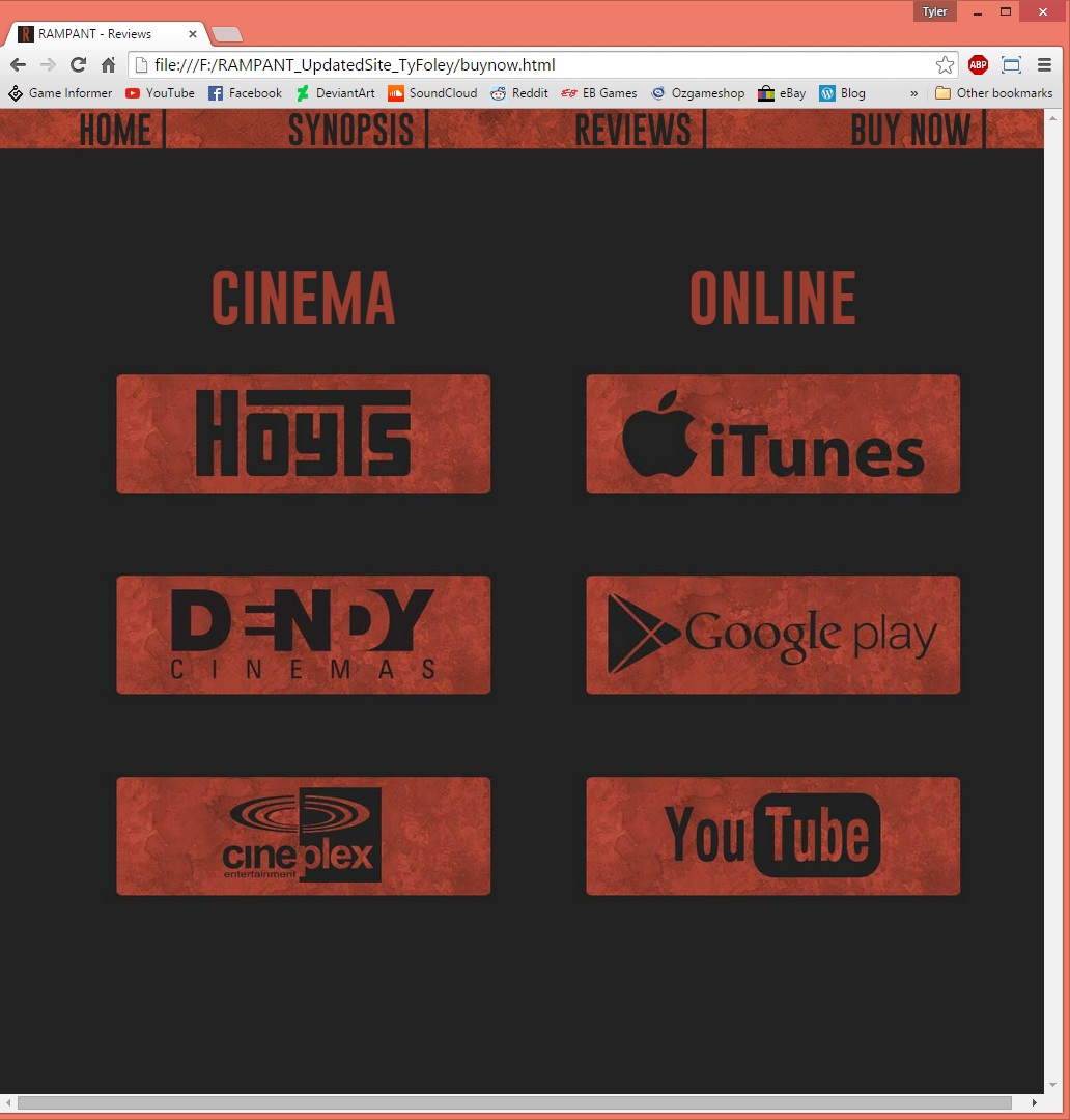

The completed “buy now” page for the RAMPANT website on iPhone, iPad and widescreen monitor dimensions. I’ve unfortunately sacrificed too much visual appeal in order to cater for the functionality aspect and the responsiveness of the site, which is extremely visible when compared to my previous “Grimlins” site.
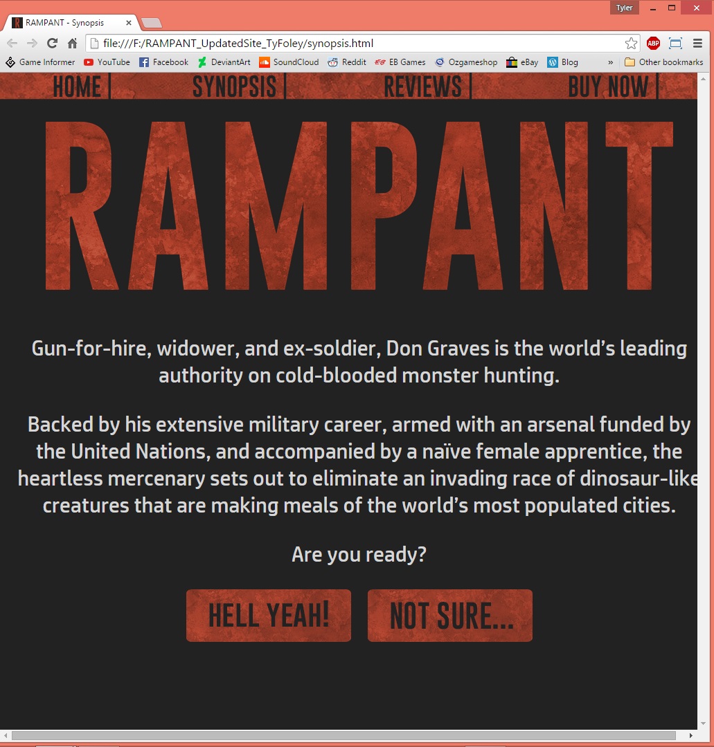
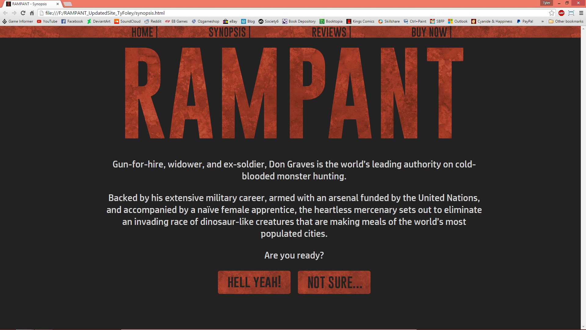
The completed synopsis page for the RAMPANT website on iPhone, iPad and widescreen monitor dimensions.
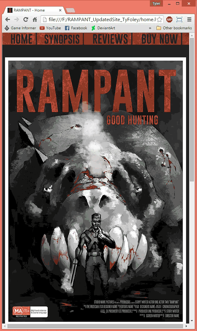


The completed home page for the RAMPANT website on iPhone, iPad and widescreen monitor dimensions. (Excuse the jittering of my screencapture software in the iPhone layout’s .gif)
In order to quickly and effectively see how my website appeared on varying resolutions outside of Dreamweaver and inside the actual browser window, I installed the Window Resizer extension for Google Chrome. At any time, viewing any of my HTML files, I could open Window Resizer’s drop-down menu and select from 10+ preset resolutions that modified the size of my browser to suit.

Whereas the fluid grid outlines and markings within Dreamweaver would often block my view of the actual site, Window Resizer gave me a clean uninterrupted view of my pages and was extremely helpful throughout the design process.
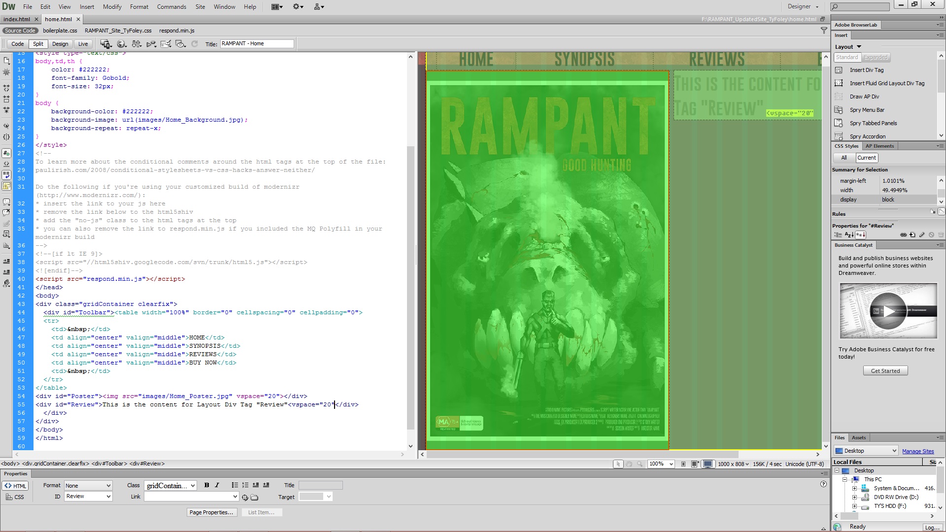


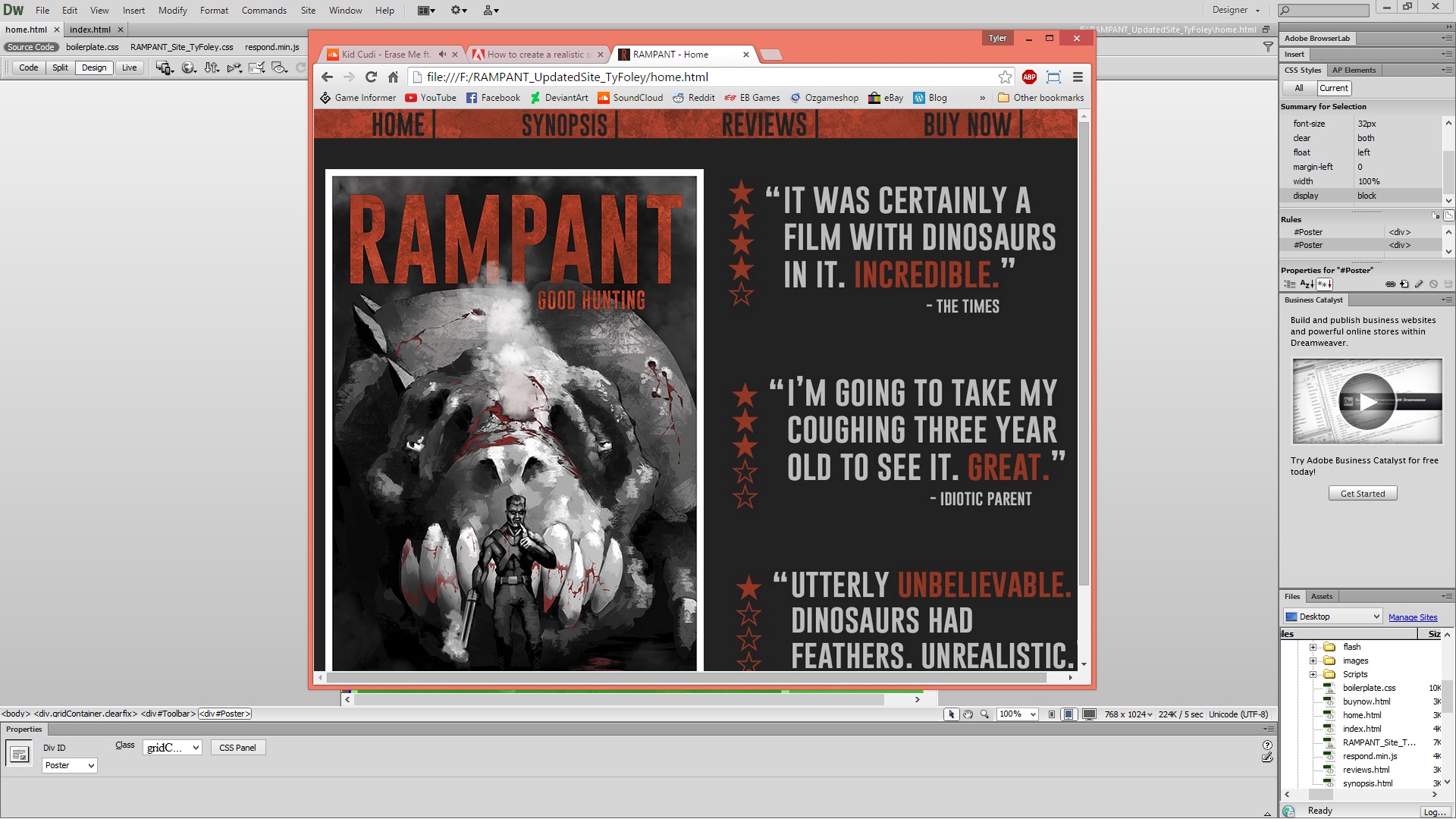
When first conceptualizing the layout of RAMPANT’s home page, I knew I wanted a simple hub that effectively answered the visitor’s question: “Why should I be here?”
While providing immediate access to every page of the site through the toolbar, I wanted the home page to contain the poster and the public’s opinions of the film. Obviously the reviews exhibited in the page are mock ones and if this was to be an official site only the most positive reviews would be featured here.
As a foundation for all of my pages, I used a Fluid Grid Layout containing 20 columns, allowing for extreme flexibility when aligning and resizing div containers and objects.
In regards to my Needs, Wants, and Desires, as frequently asked by my teacher, I would have liked to implement a social media tab. The beginnings of one can actually be seen in some of the screenshots, however to Link each social media icon, I had to insert each icon individually and the adaptive layout of the page did NOT respond well to them, even when inserted into a Table. In the end I sacrificed this idea for the sake of completing the task on time.

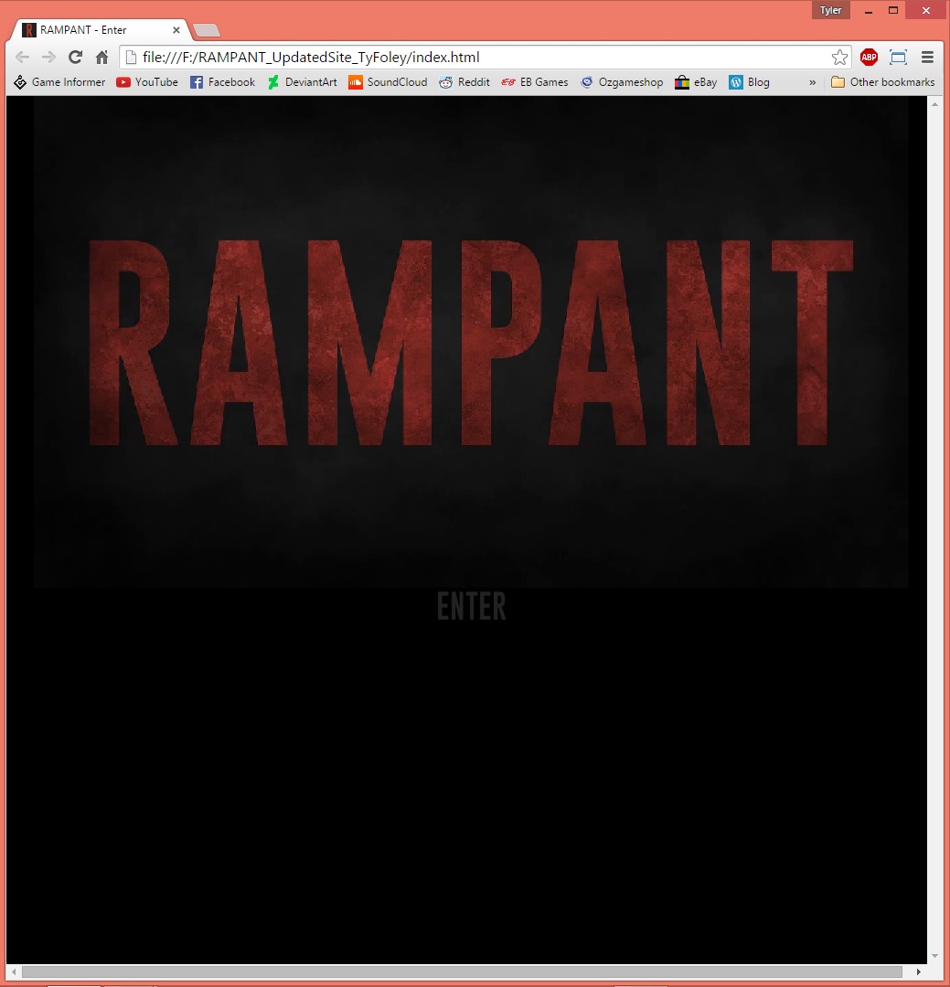

The completed splash page for the RAMPANT website on iPhone, iPad and widescreen monitor dimensions. As explained below, I intended for a simple and minimal splash page that gave off an eerie and ominous effect.
In order to further the feeling of a responsive website (in addition to its adaptive treatment of screen resolution) I coded the “ENTER” button to have a subtle rollover state, giving the visitor this feeling of acknowledgement of their actions and inputs (this is also employed in the site’s toolbar).

The completed splash image graphic converted to .gif format.


When working on the splash page for my chosen film, I knew I wanted something simple and minimal that also featured the thriller-ish theme of the film in some way.
Knowing that I was required to implement some form of video or animation in my site, I opted to create a simple piece of flash that featured the film’s title and overlayed it with a smoke/particle effect I created in Adobe After Effects (visible in the third and fourth screenshot) using this tutorial from Adobe Content Corner.
When converted to a Multiply layer in Photoshop, the smoke overlay gave off this eerie, shifting distortion over the title which I’m extremely pleased with. Using a smoke-shaped brush to darken the edges around the animation, I gave it a more cinematic feel and allowed it to blend into the black background of the splash page and hide all borders.
To give that final illusion of professionalism to the graphic, I employed the knowledge imparted to me by an animator from the ANU School of Art: Slicing the animation in half, rearranging the said halves and making use of a cross-fade to make the animation loop almost flawlessly. In doing so, I make the four-second animation appear to go on forever without out any telltale signs of looping and significantly lowering the overall file size.

The completed poster. Nearing the end of the design process, I elected against any more colour as I felt it would complicate the design too far. I wanted the poster to embody the film: Dark, gritty and all about the blood.
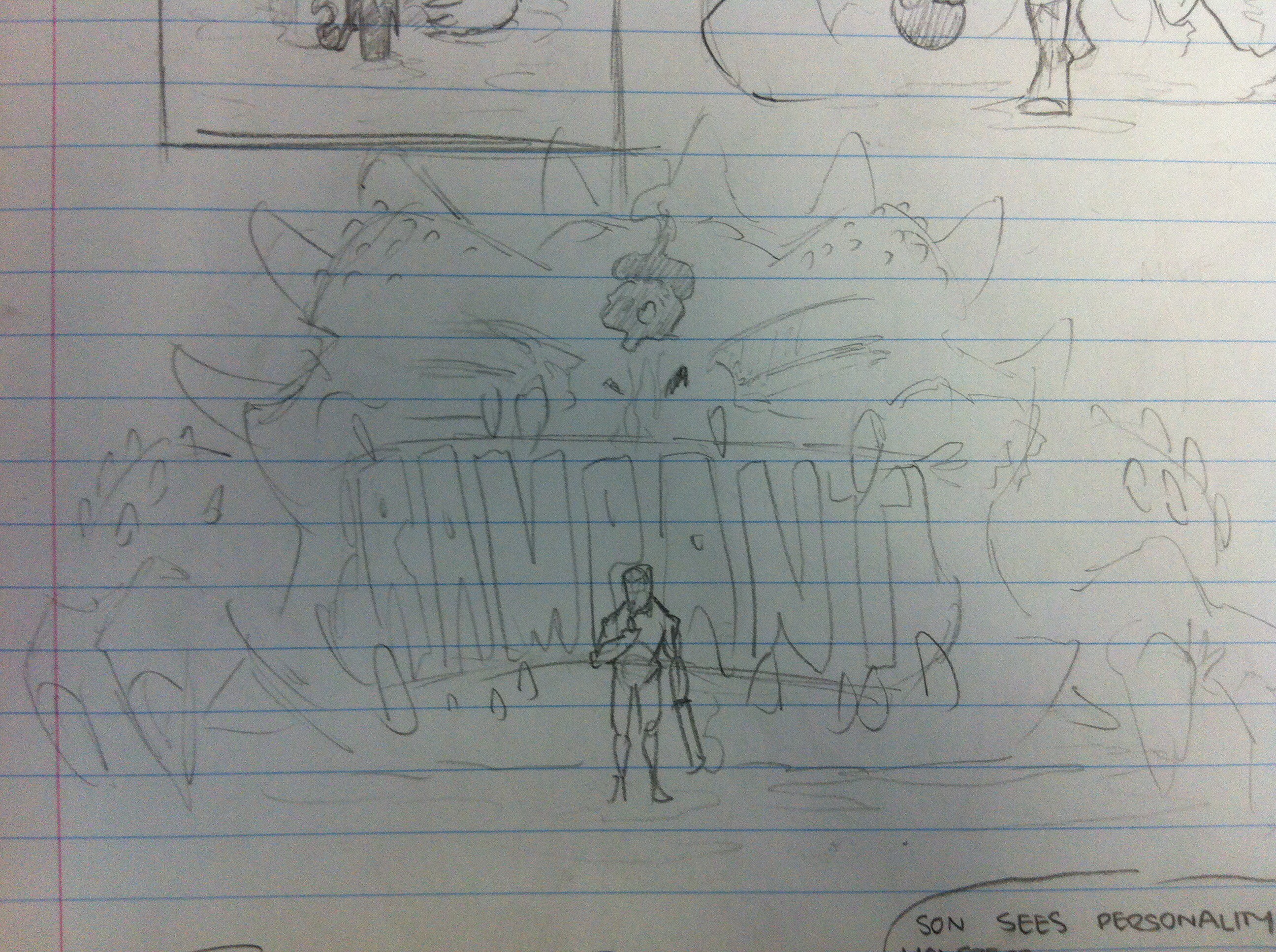
 Draft Four, fully rendered. Considering the heavily-textured dinosaur in the midground,I scrapped the idea of including a destroyed city in the background as it would have been just too much visual stimulation.
 Draft Three, featuring the refined protagonist.


The process detailing how I created the protagonist of the film, Graves. Beginning with the pencil sketch in Photoshop, I built a solid silhouette using the Lasso tool and then locked the remaining transparent pixels. This allowed me to paint a lot looser, acheiving that brushstroke aesthetic without ever altering or breaking his silhouette.
Fitting in with the aesthetic of the dinosaur, I aimed for strong contrast between the shadows and highlights.

Draft Number Two featuring the central character, the dinosaur’s body and basic notes on what I intend to achieve.
The first draft of the Rampant film poster containing the bare basics: The title, the tagline, the dinosaur head and the classification.


The process of digital creation of the dinosaur’s head, intended to be a central feature in the film poster. Importing a vector base of block-coloured shapes into Photoshop, I began playing around, adding texture, shadows, lighting, etc.
Early on in the process, I desaturate the image in order to gain a central focus on the values, as the colours can be applied later on. Using my Wacom tablet, the Lassoo tool and a simple chalk brush, I aimed for a semi-realistic image with a painterly texture. As with most of my non-assessment illustrations, airbrushing was not allowed. For me, airbrushes are simply too fake and artificial for something as organic and scaly as dinosaur skin and so no blending or gradients were directly implemented, but rather implied through the use of varying values and brush strokes if required.
Downloading a tea-stained texture by MapleRose from Lost and Taken, I Placed it in Photoshop, created a mask using the silhouette of the title, added a colour overlay effect and adjusted the hue, saturation and levels to suit the bloody, gritty tone of Rampant.

I have not yet seen this film but I have never wanted a poster on my wall so bad. The hyper-saturation of the colours are reminiscent of Guillermo del Toro’s palettes in many of his films (as explored in my research task) and I think it is absolutely beautiful.
Inspired by the dirty, stained texture overlay of the “Mad Max” title in the poster, I wanted Rampant’s title to contain a similarly gritty texture, rather than just block colour.

Starting in Adobe InDesign, I have begun sorting the layout and planning on where certain elements are to be placed. Taking a page out of Mad Max: Fury Road’s books, I have opted for a large, bold title, taking up roughly a quarter of the poster.
The tagline has been moved from the vertical centre to allow the smoke from the dinosaur’s head to drift up and over the title.

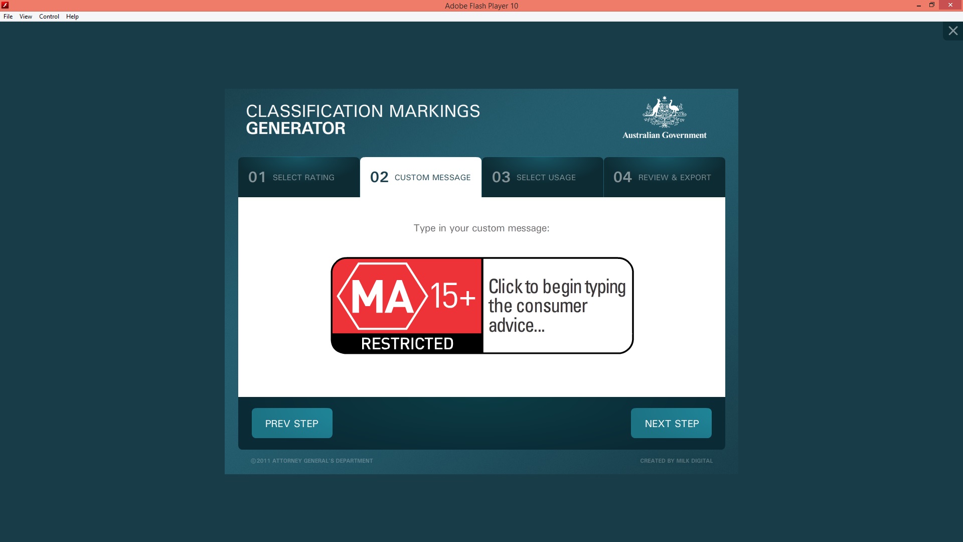
As I begin to find and create various movie-related material for my poster and website, I have found the official Classification Markings Generator made available by the Australian Classification’s website. The generator is a downloadable executable file that allows me to create and export an official customised classification icon for my film.

After comparing all of the fonts to eachother under a similar colour scheme to that intended of the poster and website, I’ve decided the font ‘Gobold’ by Situjuh Nazara will best convey the strong, bold, “monster movie” theme of Rampant.
The text using Gobold in the graphic above is the bottom-most example.

Moving on to identifying the typeface I want for my logo and poster, I followed my teacher’s advice and searched dafont.com (using the Preview function) for a font that will suit my theme and design. When setting out, I knew the title had to conform to several preferences:
- Sans-serif
- Simple
- Bold
- Condensed width-wise
- Blunt apexes on the m’s and n’s
In acknowledging all of this, I know that I need to take an original focus on Rampant’s own theme, avoiding simply ripping off Godzilla’s winning formula.


Conducting some research and looking for film posters with similar aesthetics (or at least similar elements) has turned up the results above. Click any of the thumbnails for an enlarged view.
From the beginning, 2014’s Godzilla posters (the first two thumbnails) have been the primary inspiration for my desired aesthetic. The way in which they capture something of such a large scale, something that is such a force of destruction, and manage to convey such a calm tone is what I’m really aiming for.
Tonally, I imagine Rampant, when focusing on the relations between its characters, being a primarily dark and almost calm film that, with little notice, explodes into enormous action sequences before falling back into the quiet and refocusing on human nuances. (The closest real world example of this I can think of would probably be Sin City)

A more refined design of my desired poster layout.


Further brainstorms of the desired aesthetic of my poster. The general theme of “burly shotgun-wielding man in front of dead dinosaur” is pretty set in my mind. I’m imagining a rather desaturated palette with deep red elements, similar to the style of Sin City.

Beginning with a brainstorm of my desired film genre and title for this term’s Student Directed Task, the rough outline of what I want out of my design is beginning to emerge.
S3 STUDENT-DIRECTED TASK: “LIGHTS, CAMERA, ACTION…”

The ‘Store’ Page.

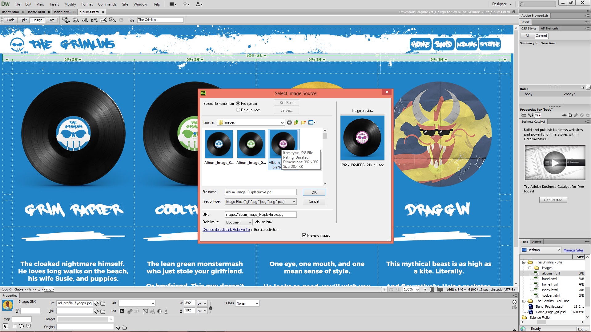
Repeating the same process for the ‘Albums’ page, I replaced the character profile images for the previously created mockup images. I then went online, found an “add to cart” icon, Image Traced it, then replaced the bio comments for it.
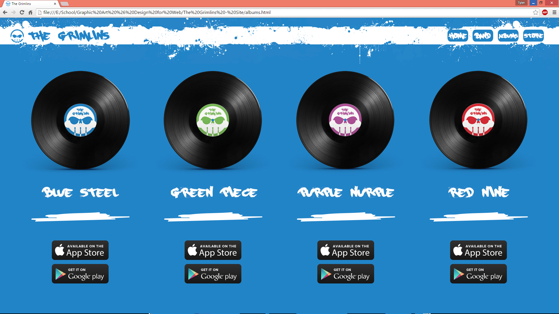
The ‘Albums’ page.
Using the ‘Band’ page as a template, I simply used a vinyl mockup, inserted The Grimlins’ logo, and replaced the ‘Band’ profile images for vinyl records that link to each album’s respective music videos. In addition, I also replaced the character comments to iTunes and Google Play icons.
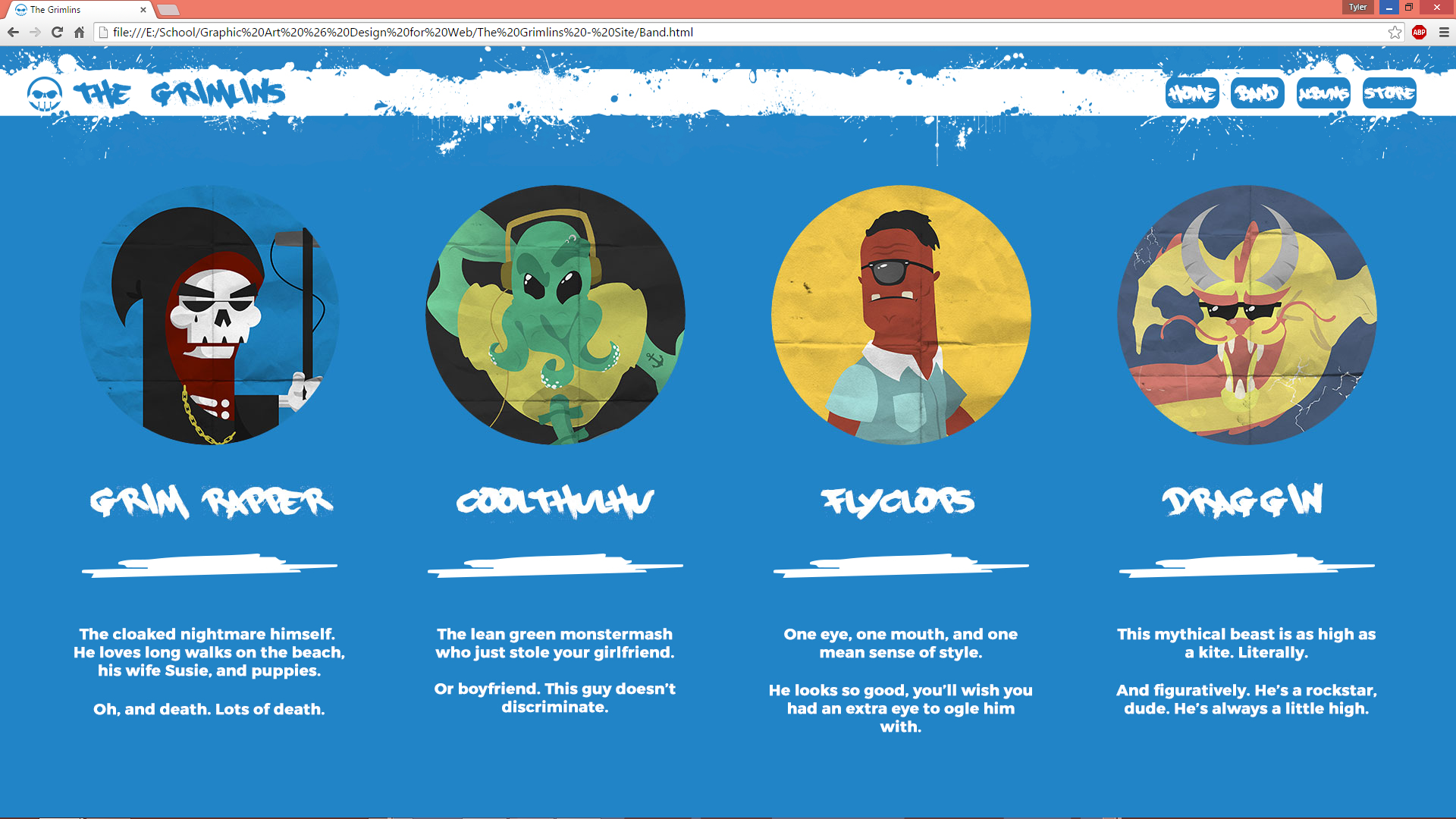
The ‘Band’ page

In achieving my ‘want’ as described in the previous comment, I implemented a snarky/humorous comment for each character, giving a glimpse into the personalities that are The Grimlins.
Moving onto the ‘Band’ page of The Grimlins’ site, I wanted an easily navigable ‘meet the band’ kind of page. Considering the “Needs, Wants & Desires”, I needed the page, I wanted a glimpse at their character through a comment or two, and I desired a respective page for each character in which the full character poster was viewable, downloads of said poster were available, and even more information was present.
In retrospect, I was unfortunately able to fulfill my desire due to my inconsistent time management.

The ‘Home’ page.
 As a feature for my homepage, I opted for a .gif that cycled through each of the bandmembers. To do this, I Placed each of the previously made characters, made heavy use of Photoshop’s Timeline tool and the alteration of each character’s opacity over certain durations of time.

Once I had completed the toolbar, I simply saved it and set it as the background image in Dreamweaver. In the settings, I selected for the background image to repeat along the x-axis only, allowing the toolbar to span the entire width of the monitor, no matter the resolution. I also made the toolbar’s ends tessellate so that the repeat process is seamless.

An early view of the toolbar in progress. At this point in time, the spatter was a little more wild than I eventually settled on, but the main idea is still evident. Making sure each spatter remained as a Smart Object to avoid any pixelation, I simply arranged them in the space I wanted, switching between white spatter and blue spatter.

From determining the genre of my chosen band, a mix of punk, rock, and electro, I wanted a theme that was bold, bright, and a little messy. To make my toolbar distinct from ordinary straight-lined, strictly-linear bars, I chose to implement a paint spatter-like effect. To do this, I simply found a free online download containing a catalogue of vectorised paint spatters and brought them into Photoshop to make my toolbar a little more interesting.
To establish the aesthetic I wanted, I relied heavily on Photoshop to create the images and tabs that exist within the table structure. The above screen capture displays my working on the logo and band name that exists in the toolbar.

In order to create the FavIcon, the little icon in the tab of a website, I uploaded The Grimlins’ circular logo to an online FavIcon generator and then inserted it into the DreamWeaver document of each page.
Beginning with a blank HTML template, I established the background colour and began working on the layout and structure. In order to gain the structure I planned on, I made heavy use of tables and modifying, locking and unlocking the dimensions of the cells and placing images within those cells.

iPhone 5s decal mockup. This is an element intended to be used in my site’s Store page.

The website plan for The Grimlins’ site. The main idea is a hierarchical layout consisting of a Home page, followed by a Band, Albums and Store page. The Band page will stem into four individual pages (all using the same layout) each showcasing a particular band member.
The main toolbar will be present on every page, allowing access to any primary page of the site within a single click. The landing page is deprived of ink on this page as I am still considering whether or not I like the idea. I’m imagining a blue page, the border spattered with white paint, featuring the Grimlins logo front and centre.

Visiting http://www.melbourneIT.com.au, I proceeded to check whether my band’s name could be secured as a URL. According to the site, all URL formats are available, probably largely due to the deliberate misspelling of the word “gremlin.”
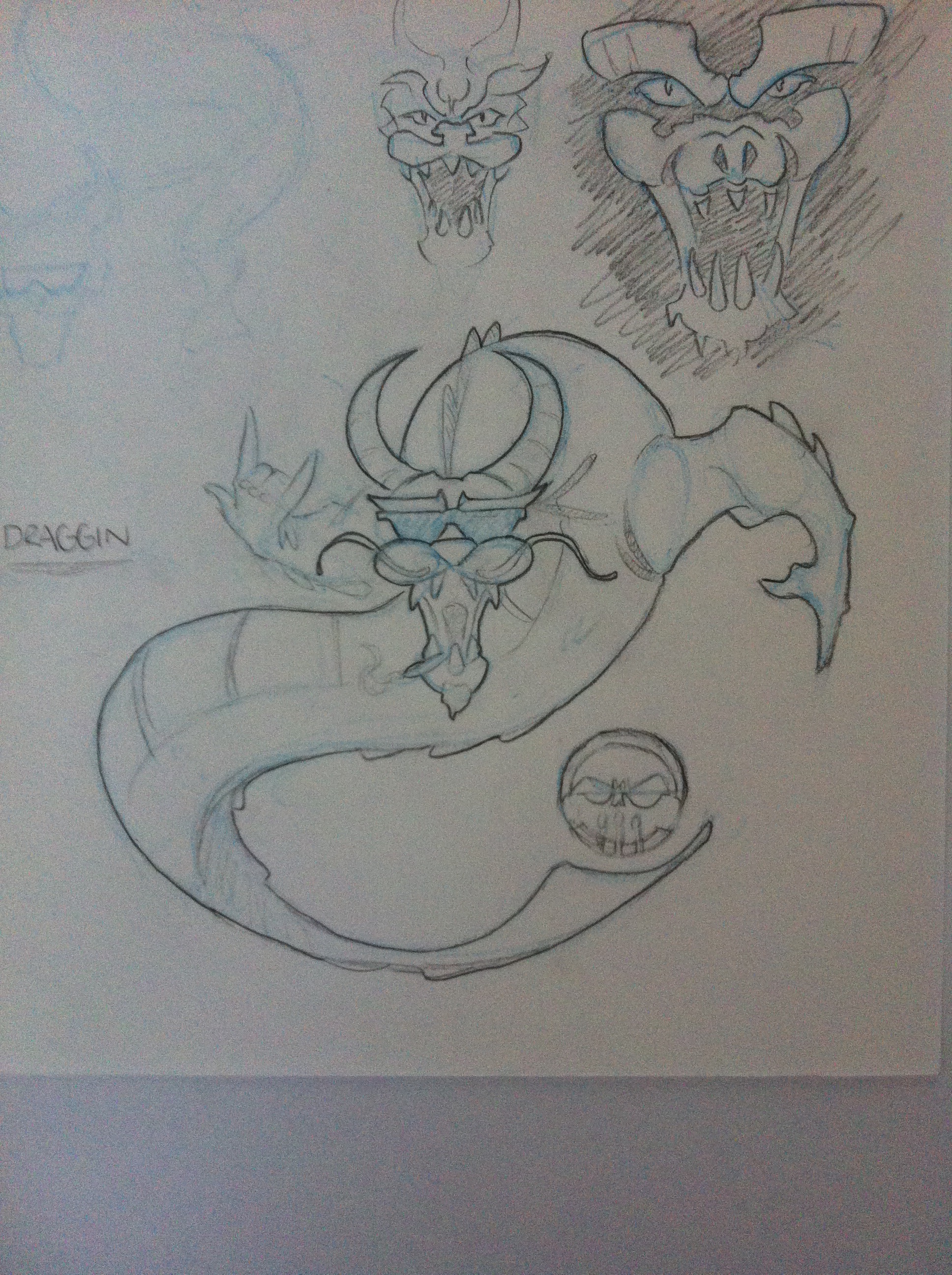

Draggin is the fourth and last band member of The Grimlins to be created in vector form. With all four characters now digitally accessible, I can employ each of them into the website, allowing for more possibilities within the Dreamweaver aspect of the assignment.
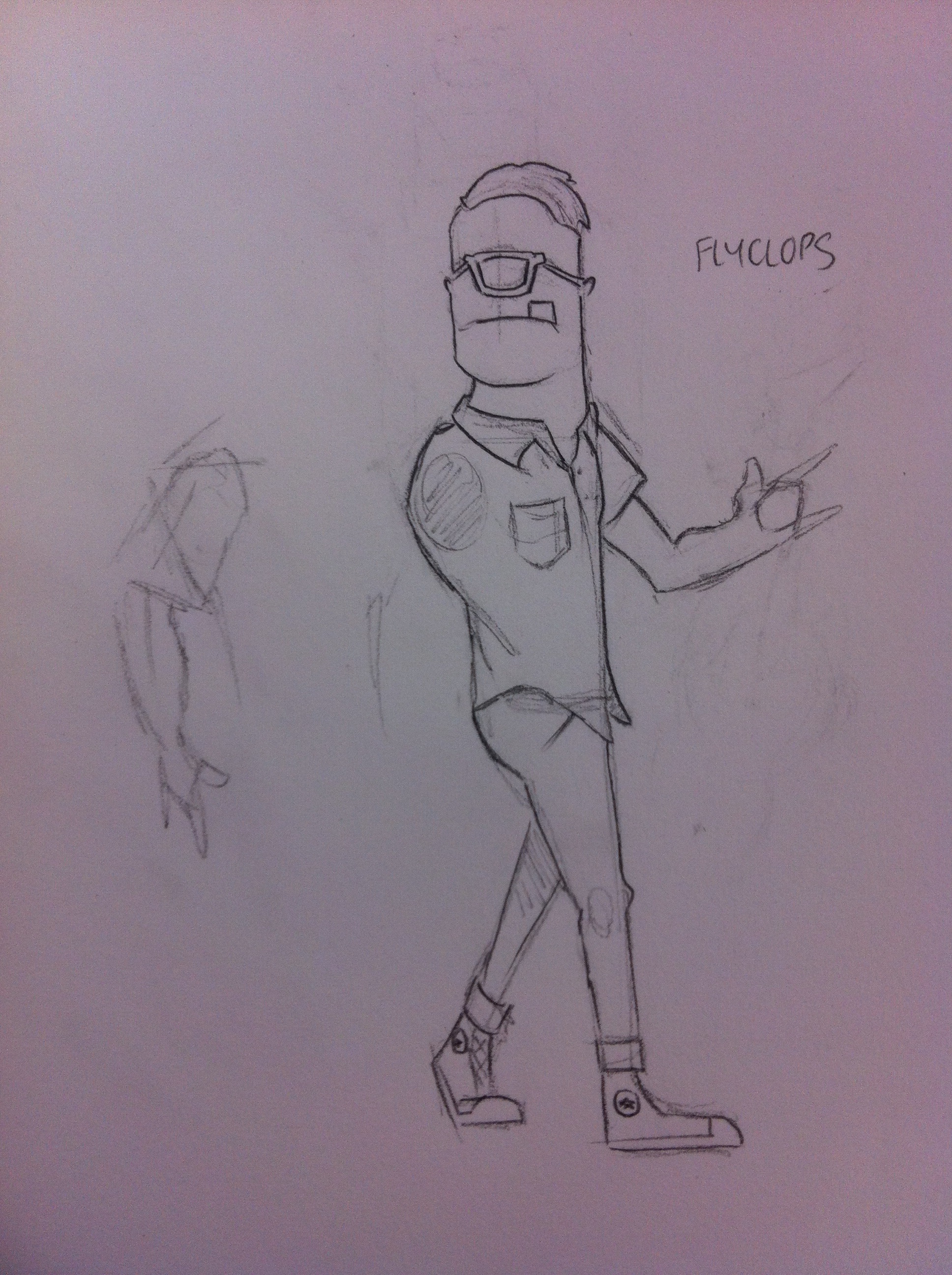

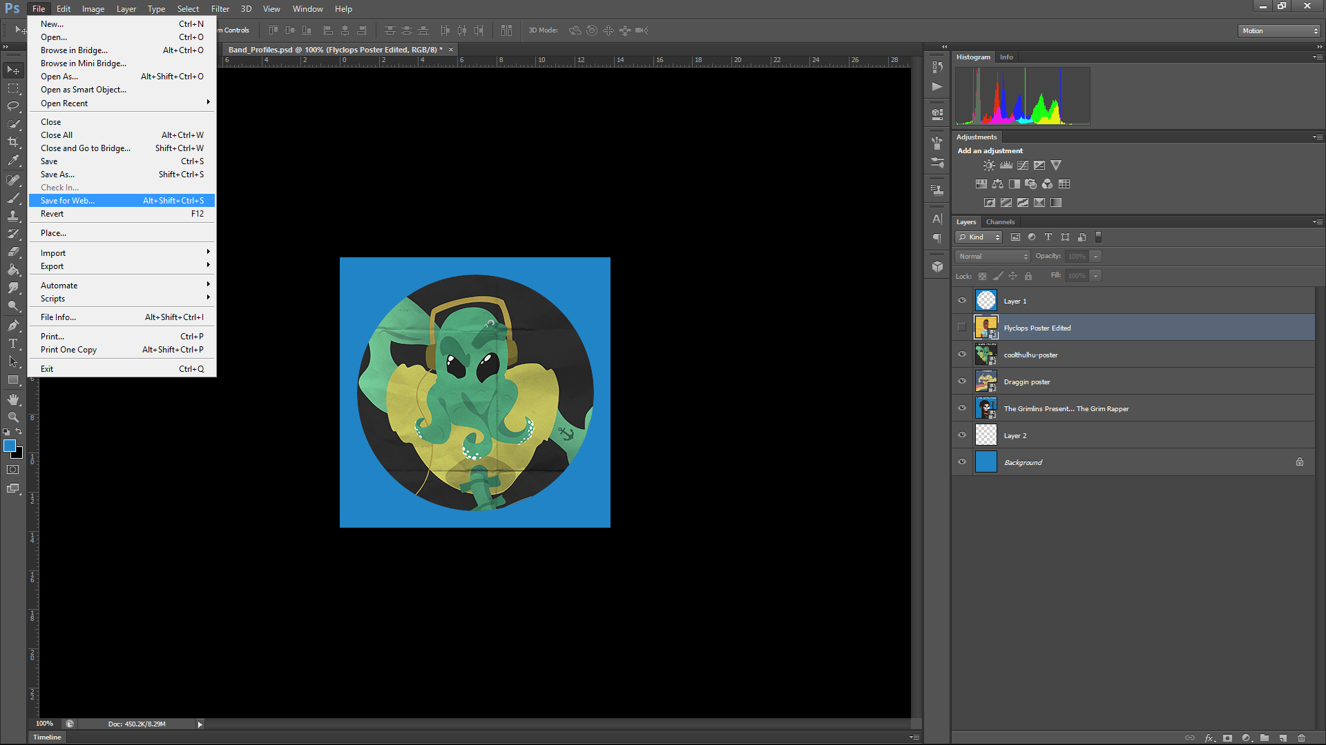
Coming straight out of the “Sugar Skull” Design Emergency, I was keen to get back into creating another member of the band. Here is both the foundation sketch and the finished vector illustration for the third Grimlin, Flyclops.
Coz he’s fly.

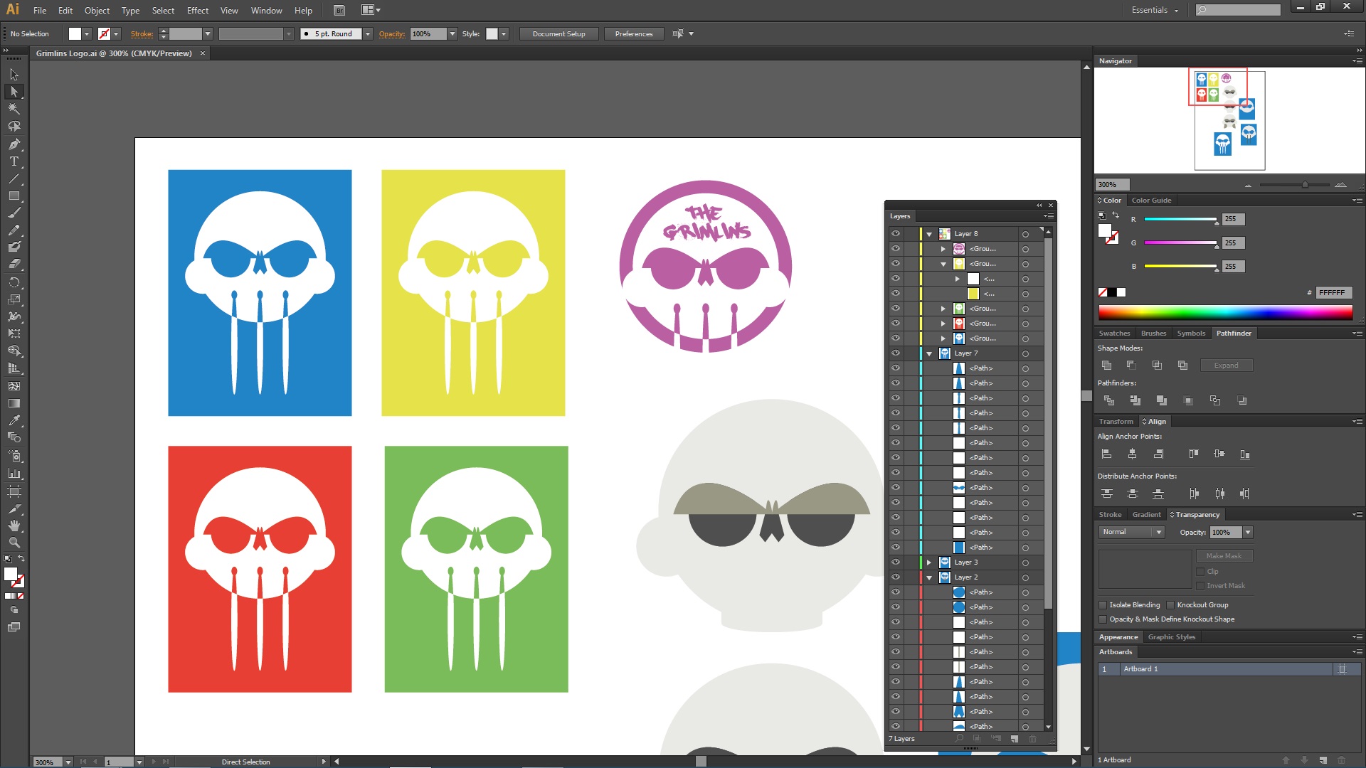
Screen-grab of a mid-process Coolthulhu. It has only truly occurred to me halfway through the creation of these creatures just how many shortcuts and techniques I’ve picked up from the previous semesters dealing with Illustrator and Photoshop. To identify a few:
The use of black or white and the manipulation of opacity to create highlights and shadows, picked up from first semester’s “Cartoon Style Space Scene” tutorial.
The manipulation of stroke weight and the employment of the Pathfinder tool, learned from the “From Sketch to Vector Art” tutorial.
The employment of the Pen tool and the adjustment of Anchor Points and Handles, picked up from second semester’s in-class Illustrator tutorials.
The use of overlay layers to create varying textures (evidenced by the ‘folded paper’ effect in the final posters) learned from last year’s “Facial Symmetry” in-class task.
All of these techniques have been employed in the creation of The Grim Rapper and Coolthulhu, and the familiarity I now have with Illustrator, gained from a little over a year of use, has proved invaluable throughout these assessment tasks.

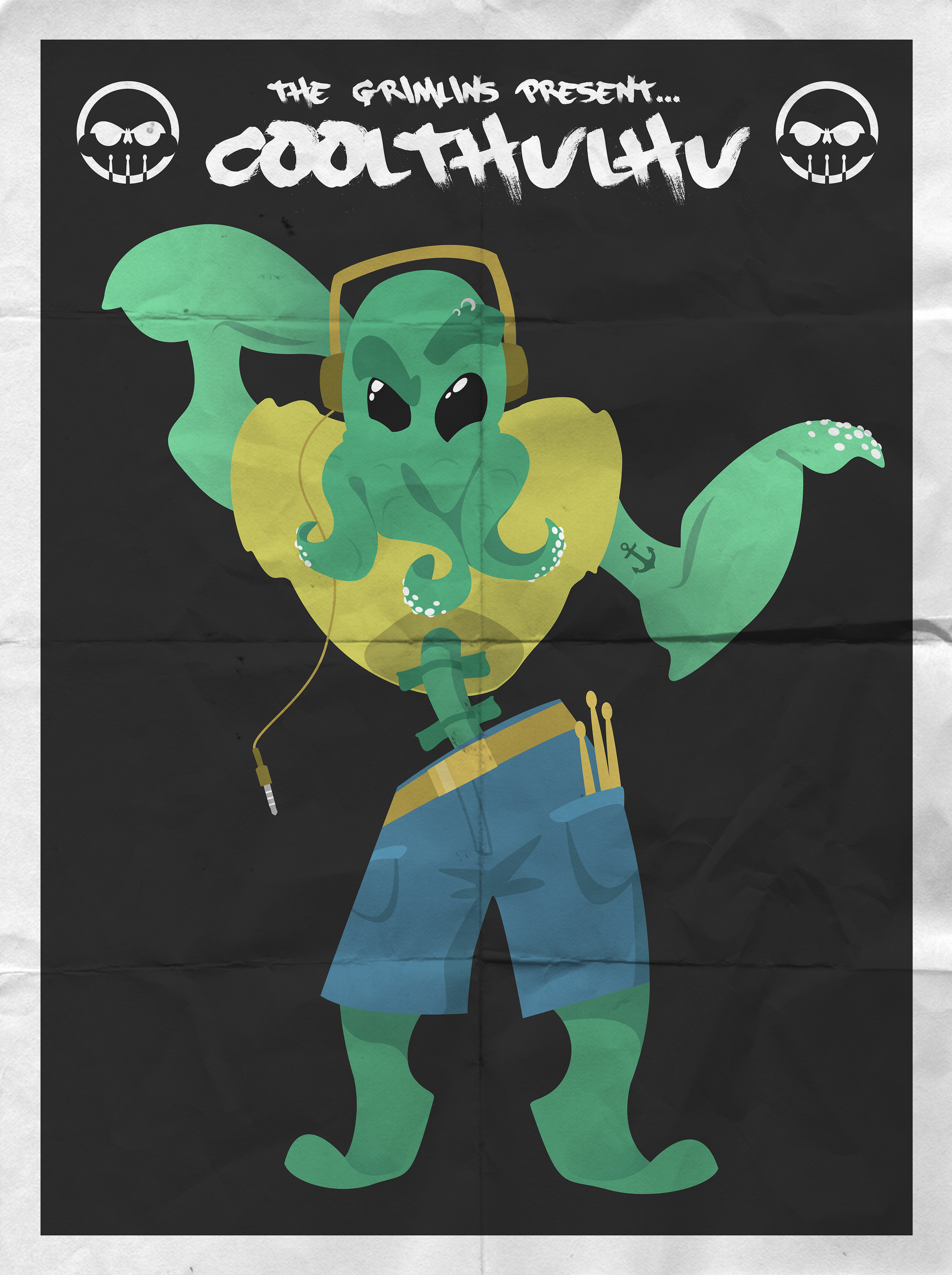
Above is the initial sketch used as the foundation and the finished vector illustration for my second vector-based character, Coolthulhu.


“The Grimlins Present… The Grim Rapper”
This is the first of the bandmember ‘profile images’ that will be available in a “Band Bio” page of the website. I decided that if I’m to introduce fictional, ‘virtual’ bandmembers similar to The Gorillaz, I may as well visualize them and employ them as elements for my website.

Advertising poster mock-up featuring the logo. I’m really pleased with how the logo looks on its own, too, with the “The” centered directly over “Grimlins.”

Stickers and pin mock-up featuring the logo with and without the band name.

T-shirt mock-up featuring the logo with the band name. The font used for the band name is PaintCans by RasOne and I feel its gritty, wonky, almost punky, style fits nicely over the clean vector graphic.
Further experimentation lead me to settle on the drumstick-skull logo (both with and without the logo, as desired).
In order to give the three drumsticks meaning (as it should technically only have two, but that looked weird) I intend for it to represent the ‘gimmicks’ and the band’s bizarre traits. The three drumsticks symbolising Coolthulhu’s ability to play with three: one in each hand and one with his tentacles.

Taking my logo idea to Illustrator, I began toying with variations and tests with colour. Following in the footsteps of deadmau5, Daft Punk, and the other logos in my “Identifying the Competition” research below, I wanted a clean, two-tone logo.

A close-up of a particular logo idea that I’ve taken to. While I’m not too sure about the use of drumsticks for the ‘M’ as it would restrict the logo to always feature the band name (I’d prefer my logo to be flexible with and without the inclusion of the name), I feel comfortable in elaborating on this in Adobe Illustrator.

Returning to the page in which I first conceptualised the name “The Grimlins” (top half), I decided to fill the bottom half with a quick brainstorm of potential bandmembers, doodles regarding more logo ideas, and some concepts for another member, the Grim Rapper.

Brief analysis and identification of band logos within similar genres. I’ve noticed that all of the provided logos are capable of being presented in two-tone format, in addition to having colour employed.

Beginning the design process for my latest assessment piece, this is a brainstorm page that went from a simple mind-map of music genres (top half) to a brainstorm of possible avenues for my chosen band, Grimlins (a working title), addressing the genres it will specialise in, the aesthetic of the band, and a look at a few logo ideas, none of which I am particularly settled on.
The colour scheme I have not yet settled on. The idea of a “dirty blackish grey” doesn’t fit my vision of the band and its primarily electro genre. I want it clean and bright.
Highlight of this page is Coolthulhu, the first conceptualised member of Grimlins. His gimmick is he can play the drums with his face-tentacles. He’s awesome.
 The result of the in-class task of creating a simple webpage showcasing our “top 10 movies”. Using the provided HTML basics sheet, I created the foundation of the page before importing it into Adobe Dreamweaver. From Dreamweaver, I managed to create a much more sophisticated (and more functional) final product.

One thought on “S3 PROCESS WORK”